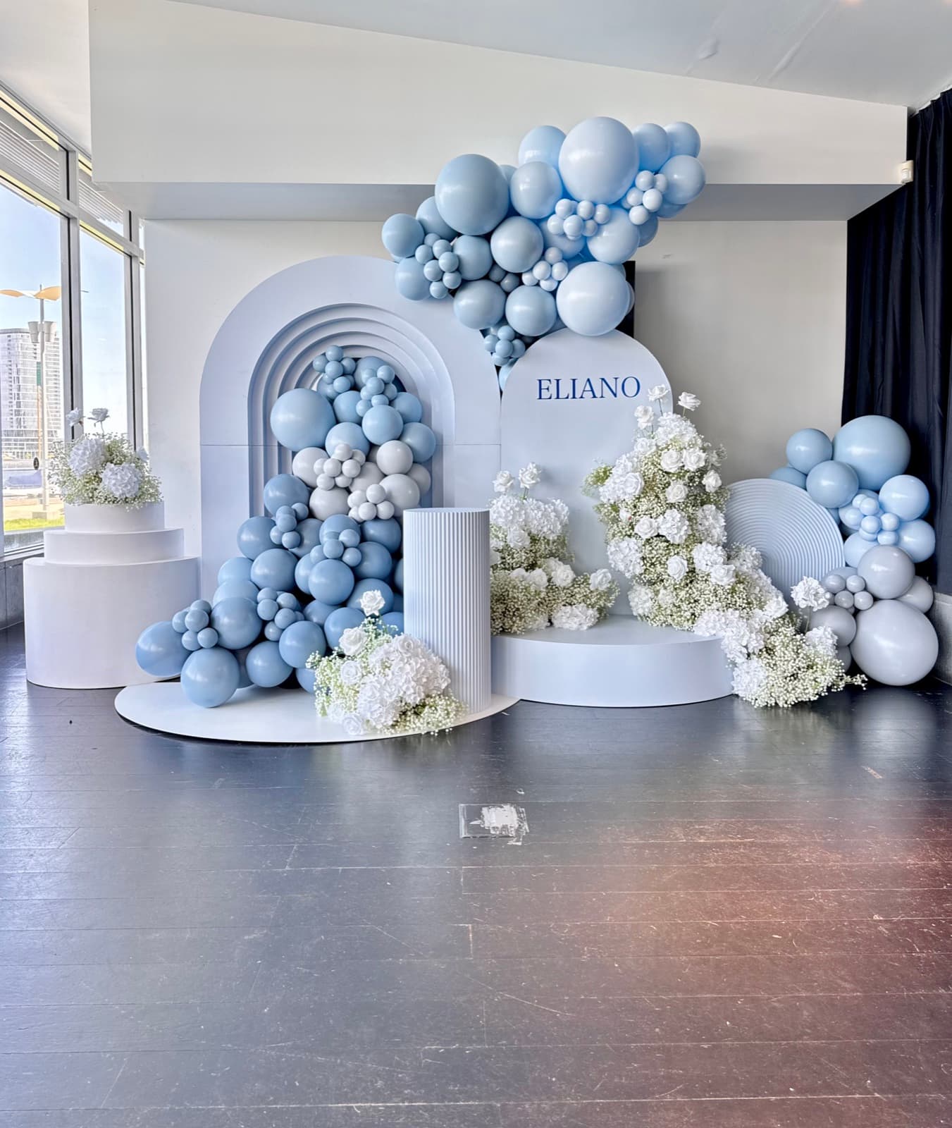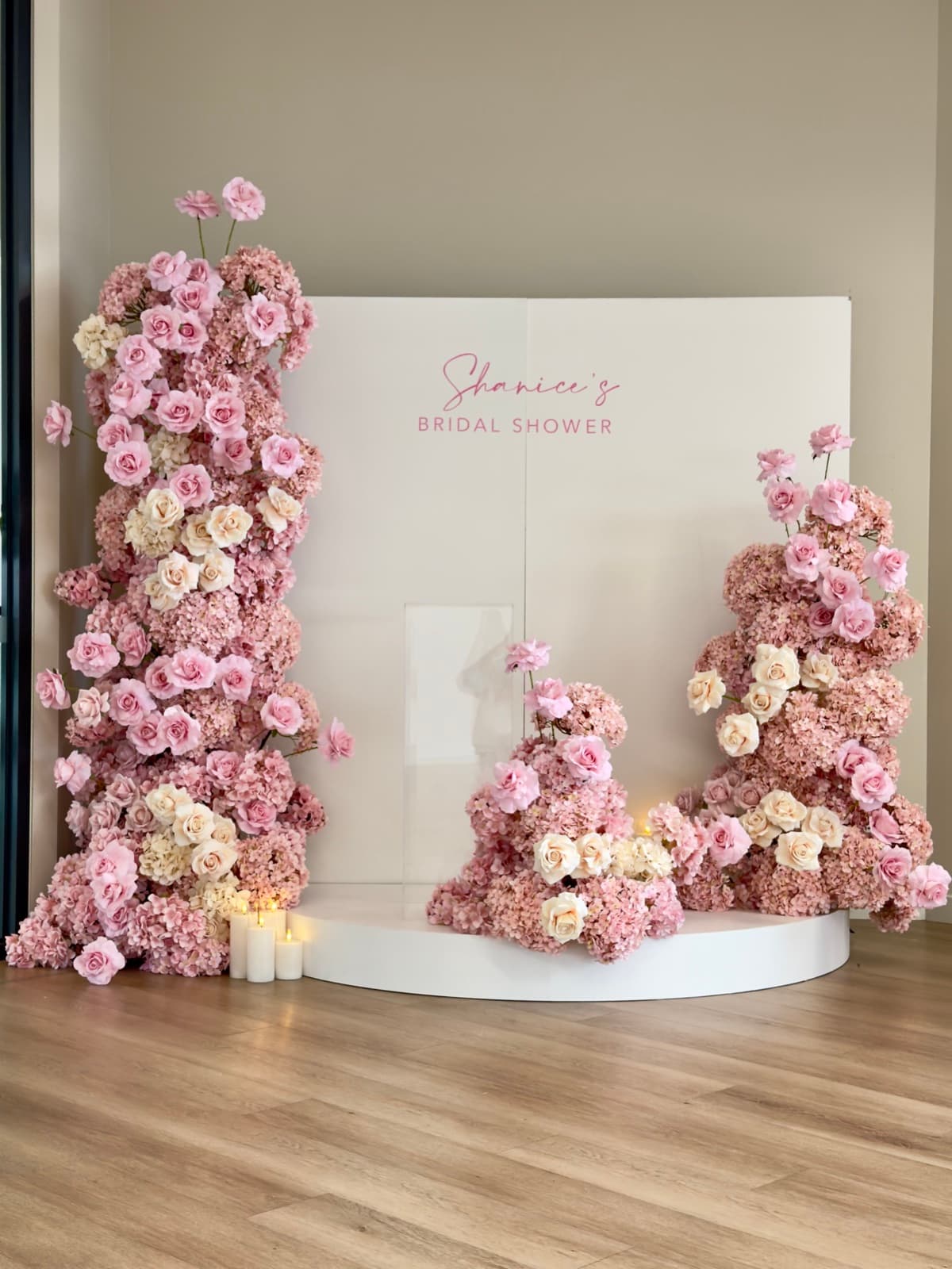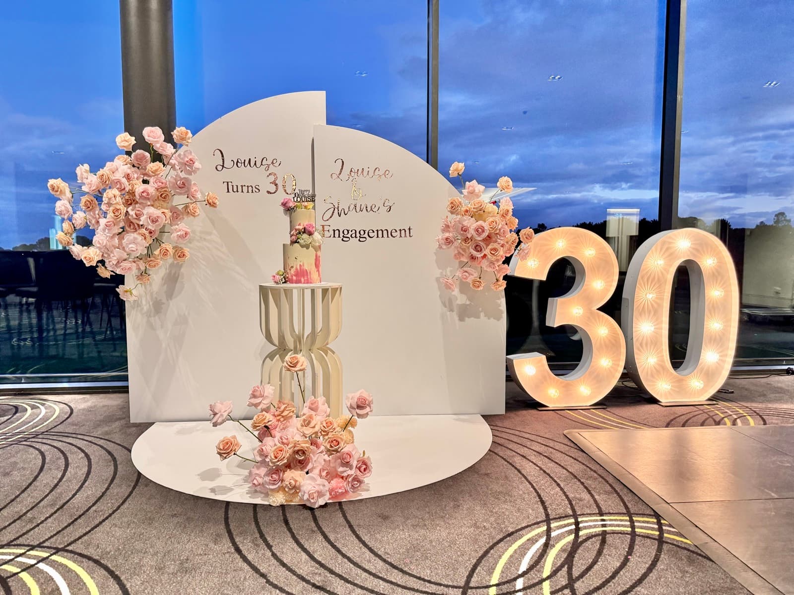
Your colour palette is the foundation of your entire event design. Every element — balloons, draping, florals, table settings, and signage — flows from this choice. Getting your colours right creates cohesion and polish; getting them wrong creates visual chaos. Here is our guide to choosing the perfect palette for your 2026 Melbourne event.
Trending Colour Palettes for 2026
These are the colour combinations we are seeing most across our weddings, birthdays, baby showers, and engagement parties in Melbourne this year — many of them mirroring the colour trends highlighted by Elle Decor:
- Sage and cream: Soft, natural, and calming. This palette works for every event type and is especially popular for baby showers and christenings.
- Terracotta and dusty pink: Warm and romantic. This earthy combination is a favourite for weddings and engagement parties.
- Navy and gold: Classic and sophisticated. This palette works beautifully for corporate events, milestone birthdays, and formal celebrations.
- Blush, mauve, and champagne: Feminine and elegant. A perennial favourite for baby showers and bridal events.
- Black, white, and gold: Dramatic and glamorous. The go-to palette for 21st and 30th birthdays and New Year celebrations.
- Warm neutrals with rust accents: Organic and contemporary. This palette has surged in popularity for its modern, Instagram-worthy aesthetic.
How to Build a Colour Palette
A strong event colour palette typically includes three to four colours working together:
Base colour (60%): This is your dominant colour — usually a neutral like white, cream, ivory, or soft grey. It appears in your draping, table linens, and the majority of your backdrop. Our Backdrop Draping Set in white or ivory provides this neutral base beautifully.
Primary accent (25%): This is your main colour — the one that defines the look. It appears in your balloon installations, floral arrangements, and signage. This is where sage, terracotta, blush, or navy makes its statement.
Secondary accent (10%): A complementary or contrasting colour that adds interest. Gold metallics, deep greenery, or a bolder version of your primary accent add depth without overwhelming.
Pop colour (5%): A small touch of something unexpected — a bright floral in the centrepiece, a coloured neon sign, or metallic confetti. Used sparingly, it adds energy and surprise.
Colour Palette by Event Type
Different events lend themselves to different colour approaches:
Weddings: Romantic and cohesive. Carry your palette through ceremony, reception, flowers, cake, and stationery. Our Classic Elegance Package and Rustic Romance Package are designed around versatile palettes that complement any chosen colours.
Birthdays: More freedom to be bold. Bright, saturated colours work well for children's parties, while sophisticated tonal palettes suit milestones. A Gold Letter Light-up adds metallic warmth to any birthday palette.
Baby showers: Soft and gentle. Pastels dominate, but modern baby showers are also embracing deeper tones like sage, dusty blue, and muted mustard for a more grown-up aesthetic.
Common Colour Mistakes to Avoid
- Too many colours: More than four colours starts to feel chaotic. Edit ruthlessly.
- Ignoring venue colours: A burgundy palette against orange-tinted timber walls creates a colour clash. Consider your venue's existing colours when choosing your palette.
- Screen vs. reality: Colours look different on screens than in person — even Pinterest's curated colour palettes can look different once you see them in fabric and latex. Request physical samples of fabrics and balloons before committing.
- Forgetting the food: Your cake, desserts, and grazing platters are visual elements too. Brief your baker and caterer on your colour palette.
Need help choosing the perfect palette for your Melbourne event? Request a free quote from iDo. Events — our team will help you build a colour scheme that ties every element together beautifully. Browse our hire collection to see the range of colours available.