Your colour palette is the thread that weaves through every element of your wedding — from invitations and bouquets to table settings and cake. Pinterest trend reports show that couples are searching for palette inspiration earlier than ever in the planning process. Choosing the right combination sets the mood, defines the aesthetic, and creates cohesion across your entire celebration. Here are the colour palettes Melbourne couples are gravitating towards in 2026, with tips on how to carry them through your styling.
Sage Green and Cream: The Palette of the Year
Sage green and cream continue to dominate Melbourne weddings — a palette that House & Garden has identified as a global favourite — and it is easy to see why. This palette is calming, natural, and universally flattering. It works in every season, suits every venue type, and photographs beautifully in both daylight and evening settings. At iDo. Events, sage and cream is our most requested colour combination across Oakleigh, Coburg, and Doncaster.
Style this palette with our Backdrop Draping Set in sage behind a cream-dressed Round Moongate Arch. Add Floral Centrepiece Sets mixing white roses with eucalyptus and sage-toned foliage. Carry the green through your napkins, table runner, and bridesmaid dresses for a cohesive, nature-inspired aesthetic.
Burgundy, Rust, and Gold: Rich and Romantic
For couples who want warmth and drama, the combination of deep burgundy, rustic terracotta, and antique gold creates a rich, romantic atmosphere. This palette is particularly stunning at autumn and winter weddings, working beautifully with candlelight and warm overhead lighting. Our Rustic Arch Backdrop dressed with burgundy and rust florals paired with Gold Letter Light-Ups creates an incredibly warm, inviting ceremony space.
This palette pairs naturally with the Rustic Romance Package — the timber tones of the arch and accessories complement the warm colour story. Add Festoon Light Strings overhead for golden light that enhances the burgundy and rust tones, and style your dessert table with rich velvet accents and gold serving pieces.
Black, White, and Gold: Bold and Sophisticated
Monochromatic with metallic accents, this palette makes a powerful statement. It is the go-to choice for modern, fashion-forward Melbourne couples who want their wedding to feel like an editorial shoot. Our Gold Hexagonal Arch is the ideal centrepiece for this palette — its geometric lines and gold finish embody contemporary sophistication.
Pair it with a Custom Neon Sign in warm white for a modern focal point against a dark backdrop. White Plinths with all-black floral arrangements create dramatic contrast. The Modern Luxe Package provides the foundation for this palette with its clean lines and metallic accents.
Dusty Rose and Mauve: Soft Romance
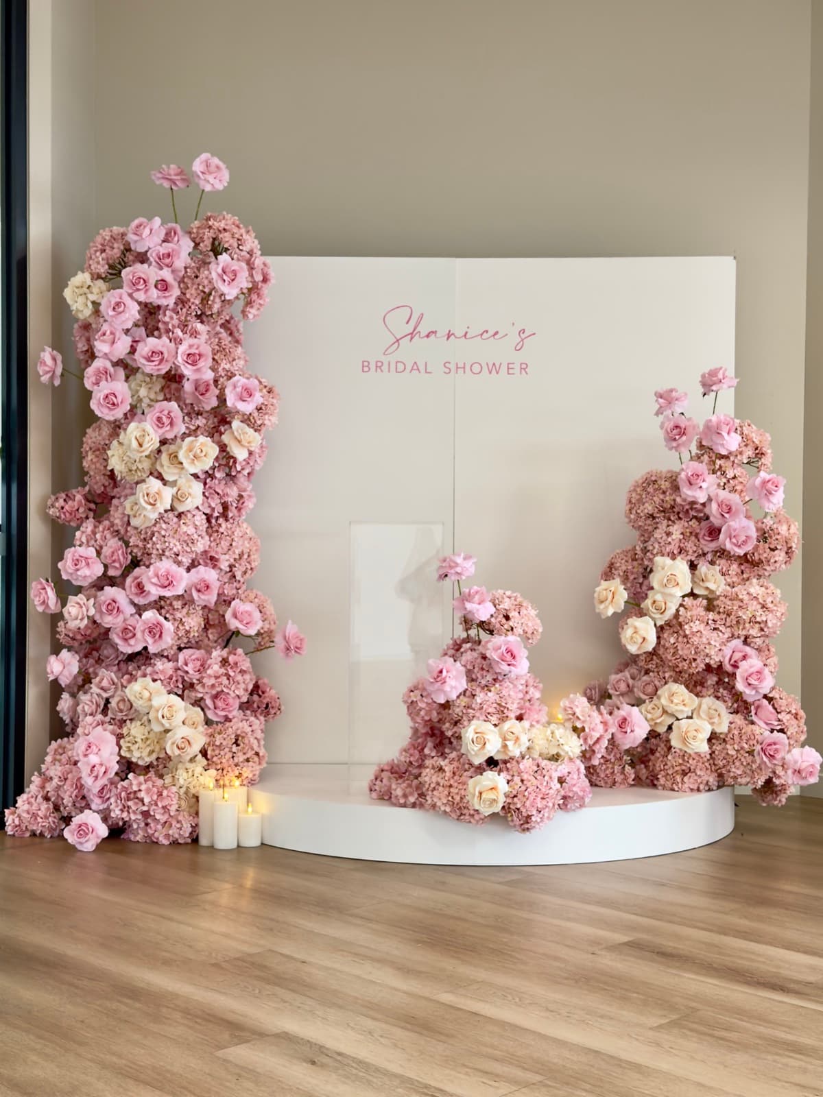
For couples who love pink but want something more sophisticated than bubblegum, dusty rose and mauve create a muted, romantic palette that feels grown-up and elegant. This combination works beautifully at garden weddings across Melbourne, complementing natural greens and warm stone tones.
Style this palette with sheer blush draping, our Floral Centrepiece Sets in mixed pink tones, and rose gold accents in your table settings. A Fairy Light Curtain behind the bridal table adds warm sparkle that enhances the soft pink tones. This palette photographs exceptionally well at golden hour, making afternoon garden ceremonies in Werribee or Point Cook the ideal setting.
How to Carry Your Palette Through Every Element
A colour palette only works when it is consistently applied. Here is how to ensure cohesion:
- Start with swatches: Gather fabric and paper swatches of your colours and check them together in person, not just on screen. Colours can look very different in real life.
- Share with all vendors: Provide your colour swatches to your stylist, florist, baker, and stationer so everyone is working from the same reference.
- Layer, do not match: Aim for tonal variation within your palette rather than exact matching. A range of shades within your colour family creates depth and visual interest.
- Use neutrals as breathing space: White, cream, and soft green provide visual rest between your feature colours, preventing the palette from feeling overwhelming.
At iDo. Events, we work with your chosen colour palette to create a styling plan that carries your colours through every element of your Melbourne wedding. Browse our hire collection to see items available in multiple colours, or request a free quote with your palette in mind — we will show you how it all comes together.